Most layouts do not fail at aesthetics. They fail at hierarchy. You can use the most beautiful typeface in the world, follow the trendiest color palette, and apply perfect spacing — and the layout will still feel off if the hierarchy is wrong. Hierarchy is what tells the viewer where to look first, second, third. It is what makes a design feel intentional rather than decorated. After fifteen years of designing interfaces, I have come to believe that hierarchy is the single most underrated skill in design education. Most design schools teach typography and color theory as separate subjects and treat hierarchy as something that emerges naturally. It does not. Hierarchy is a set of principles that have to be learned explicitly, and the principles are mostly mathematical, not aesthetic. This guide covers the principles that actually move the needle: typographic scale, modular grids, gestalt laws, the hierarchy toolkit, and the specific ways most layouts fail.
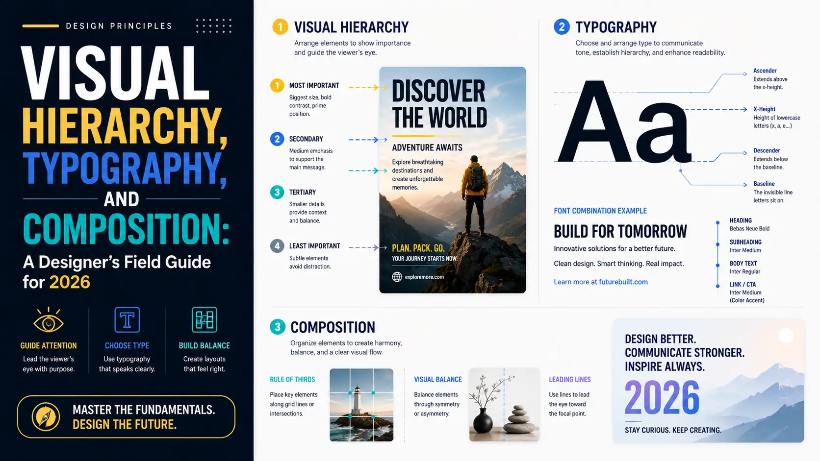
Typographic scale: the math that makes type feel right
Type sizes are not arbitrary. The relationship between body text, subheads, headings, and display text follows a typographic scale — a mathematical ratio that determines each size from the previous one. When the scale is consistent, the layout feels harmonious. When it is inconsistent, the layout feels arbitrary, even if the viewer cannot articulate why. The most common ratios are based on musical intervals, borrowed from the typographic work of Jan Tschichold and others in the mid-20th century. The minor third (1.200), major third (1.250), perfect fourth (1.333), and perfect fifth (1.500) are the standard choices. Each produces a different feel: 1.200 is subtle and modern (used by most Swiss design); 1.250 is the sweet spot for body text (used by Medium, Stripe, Linear); 1.333 is more dramatic (used by editorial sites like The Verge); 1.500 is bold and theatrical (used by Apple's marketing pages). Body text size: 16-18 pixels on desktop, 14-16 on mobile. Line-height for body: 1.5-1.6 (multiplied by font size). Max line length: 60-75 characters. These are not arbitrary — they are derived from reading speed studies. Lines longer than 75 characters cause readers to lose their place at the end of a line; lines shorter than 45 feel choppy. Line-height below 1.4 makes paragraphs feel crowded; above 1.7 makes them feel disconnected. Heading sizes are derived from body size multiplied by the scale ratio, raised to the power of the heading level. With body at 16px and ratio 1.250: H4 = 16 * 1.250 = 20px; H3 = 16 * 1.250^2 = 25px; H2 = 16 * 1.250^3 = 31px; H1 = 16 * 1.250^4 = 39px; Display = 16 * 1.250^5 = 49px. This produces a scale that feels consistent — every level is exactly 25% larger than the previous one. The 8pt grid alignment is the second half of the system. Round every size and spacing value to the nearest 8 pixels (or 4 for fine control). This ensures that vertical rhythm is consistent across the layout. Without an 8pt grid, slight misalignments accumulate and the layout feels off. With one, every element aligns to the same grid and the layout feels deliberate. Fluid typography is the 2026 standard. CSS clamp() lets you specify a minimum and maximum size with a preferred value that scales with viewport width: font-size: clamp(1rem, 0.875rem + 0.5vw, 1.25rem). This produces text that scales smoothly from mobile to desktop without needing media queries. Combined with a fluid scale calculator (the Utopia.fyi tool is the standard), you can generate a complete fluid type system in five minutes. Variable fonts enable continuous weight control, which matters for hierarchy because weight is one of the most powerful hierarchy tools. With static fonts, you have 400, 500, 600, 700 — four steps. With a variable font, you have 1-1000, which means you can pick exactly the weight that creates the contrast you want. Inter Variable, IBM Plex Sans Variable, and Roboto Flex are the workhorses of modern variable typography.
Modular grids: 8pt, 12-column, baseline
Grids are how designers enforce consistency across a layout. The three grids that matter are the 8pt grid (for spacing), the 12-column grid (for horizontal layout), and the baseline grid (for vertical rhythm). The 8pt grid means every spacing value in the design is a multiple of 8 (or 4 for fine control). Padding, margin, gap, height, width — all snapped to 8. The reason is psychological: when elements align to a consistent grid, the eye perceives them as deliberate. When they are off by even 2 pixels, the eye perceives them as wrong. The 8pt grid eliminates the off-by-2 problem. Why 8 and not 10? Because 8 divides evenly into 16, 24, 32, 48, 64, 96 — all standard sizes in screen design. 10 only divides evenly into 20, 30, 40, 50, 100, which is less flexible. The 8pt grid has been standard in Material Design since 2014, in iOS's HIG since 2017, and in most design systems (Atlassian, Adobe Spectrum, IBM Carbon) since the late 2010s. The 12-column grid is the standard horizontal grid for web layout. 12 divides evenly into 2, 3, 4, and 6, which gives you 12, 6, 4, 3, and 2 equal-width column layouts from a single grid. This is why Bootstrap, Tailwind, and every major CSS framework defaults to 12 columns. The alternative 16-column grid (used by some design systems) gives you 16, 8, 4, 2, 1 — more flexibility for asymmetric layouts but harder to reason about. Baseline grid is vertical rhythm. Every line of text sits on a horizontal line spaced at a consistent interval — typically 4 or 8 pixels. This is what makes multi-column layouts feel aligned: text in different columns sits on the same baseline, creating visual connection. CSS supports this with line-height-step (limited browser support) or with manual calculation. Most modern frameworks use manual calculation: set body line-height to 1.5 * font-size, snap every element's vertical margins to multiples of that value. Why most designs fail at grids: they pick a grid and then break it for individual elements. A button is 38px tall instead of 40. A section padding is 72px instead of 64. Each violation is small, but they accumulate. The fix is to make the grid non-negotiable. If an element does not fit, redesign the element — do not break the grid. Tools for grids: Figma's auto-layout enforces 8pt grid by default. CSS Grid and Subgrid (now supported in all major browsers as of 2023) let you specify the 12-column grid at the CSS level. Tailwind's spacing scale is built on an 8pt grid. The reason these tools exist is that grids are easy to violate and hard to enforce by hand.
Gestalt laws every designer should internalize
Gestalt psychology emerged in the early 20th century with a simple claim: the human mind perceives whole patterns before perceiving individual parts. The Gestalt laws describe how this works in practice. For designers, they are the closest thing to a physics of perception — predictable, repeatable, and applicable to almost every layout decision. Proximity: items placed close together are perceived as related. This is the most powerful Gestalt law for interface design. The space between a label and its input field tells the user they belong together; the space between two unrelated fields tells the user they are separate. Most form layouts fail at proximity — labels are too far from their fields, or fields are too close together. The fix is usually to halve the label-to-field spacing and double the field-to-field spacing. Similarity: items that look alike are perceived as related. This is why consistent button styling matters — if every primary action looks the same, users can scan a page and instantly identify the actions. Violations of similarity are equally powerful: a different-colored button in a row of similar buttons immediately draws the eye. Use this intentionally for primary CTAs. Continuity: the eye follows smooth paths. This is why diagonal compositions feel dynamic and rectangular compositions feel stable. It is also why aligned columns of text are easier to read than ragged columns — the eye follows the vertical line of aligned text down the column. Closure: the mind completes incomplete shapes. This is why a logo made of dashed lines still reads as a complete shape. In interface design, closure matters for cards and containers — you do not need to draw a complete border around a card; a corner accent or shadow is enough for the mind to perceive the card as a discrete unit. Figure/ground: the mind separates foreground (figure) from background (ground). This is the basis of all visual hierarchy. A high-contrast element on a low-contrast background reads as figure; the background recedes. The classic Rubin vase illusion (which can be read as either a vase or two faces) demonstrates that figure/ground is not always stable — and that ambiguity can be a design tool. Common fate: items that move together are perceived as related. This is why carousels and accordions work — items that animate together are perceived as belonging to the same group. It is also why a single item animating differently from its siblings (a card lifting on hover while others do not) immediately stands out. The Gestalt laws are not optional. Every layout either uses them intentionally or violates them accidentally. Most bad layouts are bad because they violate the laws without realizing it — proximity violations that make forms hard to scan, similarity violations that make CTAs hard to find, continuity violations that break reading flow.
The hierarchy toolkit: size, weight, color, space, position
Hierarchy is created by differences. If two elements are identical, neither has priority. If they differ in any way, the eye prioritizes the more prominent one. The hierarchy toolkit is the set of differences you can create, ranked by impact. Size is the most powerful hierarchy tool. A 48px headline dominates a 16px subhead. Size is also the most overused hierarchy tool — designers reach for size when subtler tools would work better. The rule of thumb is that size should be the primary hierarchy tool only for the top two levels (display and H1). Below that, use other tools. Weight is the second most powerful. Regular vs. semibold is a 1.5x visual weight increase — enough to create clear hierarchy without changing size. The advantage of weight over size is that it preserves reading rhythm; the disadvantage is that it is less dramatic. Use weight for H2-H4, body emphasis, and labels. Color is the third tool. A colored element on a grayscale background immediately becomes the focal point. The trade-off is that color is expensive — every color you add dilutes the impact of every other color. A layout with one accent color is dramatic; a layout with five accent colors is noise. The standard pattern is one neutral palette (grays) plus one accent color for primary actions, plus semantic colors (red for errors, green for success) used sparingly. Space is the fourth tool and the most underrated. Whitespace around an element creates emphasis without any visual change to the element itself. A button with 24px of margin around it dominates the same button with 8px of margin. Space is also the hardest tool to use well because clients and stakeholders tend to want to fill whitespace with more content. Defending whitespace is a recurring battle in professional design work. Position is the fifth tool. Top-left has more visual weight than bottom-right in Western reading order (because the eye starts top-left). Above-the-fold has more weight than below. Centered has more weight than offset. Position is the slowest tool to take effect because it depends on the overall layout, but it has the most consistent effect. Typographic style is a sixth, lesser tool. Italics, small caps, monospace, and all-caps each create distinction without changing size or weight. All-caps with letter-spacing is the standard for labels and metadata. Monospace is the standard for code. Italics for secondary metadata. The mistake to avoid is using these as primary hierarchy tools — they are too subtle for that. Layering these tools without creating noise is the art. A common pattern: H1 uses size + weight (display typeface, 700 weight, 48px). H2 uses weight + position (semibold, 24px, full-width). H3 uses weight + color (semibold, 20px, accent color). Body uses regular weight, 16px. This produces four levels of hierarchy without any single tool doing all the work.
Responsive hierarchy: how the rules change across breakpoints
Hierarchy principles do not change between desktop and mobile, but their application does. The most common mistake I see in responsive design is treating mobile as a smaller version of desktop — same hierarchy, same element sizes, just stacked. This produces mobile layouts that feel cramped and miss the opportunities the smaller form factor creates. Type scale shifts on mobile. The desktop body text of 16px should become 17-18px on mobile, not smaller. The reason is viewing distance: mobile devices are held closer to the face than desktop monitors, but the angular size of text needs to stay in the same range for comfortable reading. Smaller text on mobile is the wrong instinct, even though it feels like you have less space. Headings also scale, but less aggressively — a 48px desktop H1 might become 36px on mobile, not 24px, because the heading still needs to dominate the body text. Spacing scales differently. Desktop padding of 64px should become 24-32px on mobile, not 16px. The instinct to compress spacing aggressively on mobile is correct (you have less horizontal space), but the lower bound is constrained by touch target sizes. iOS Human Interface Guidelines specify 44x44pt minimum touch targets; Material Design specifies 48x48dp. Any clickable element smaller than this is frustrating to use on mobile. Hierarchy simplifies on mobile. A desktop layout can support 4-5 levels of hierarchy because the screen can show all of them simultaneously. A mobile layout typically shows one section at a time, so 2-3 levels is sufficient. Anything more is wasted complexity. The pattern is to collapse desktop hierarchy on mobile by combining levels — H2 and H3 might become the same size on mobile, distinguished only by weight or color. Reading patterns change. The F-pattern that dominates desktop text scanning becomes more linear on mobile, because the narrower column width forces longer vertical reading. The implication is that mobile layouts can rely less on side elements (right-rail content, sidebar calls-to-action) and more on vertical sequence. Important content on mobile should be at the top of the sequence, not in a sidebar. Touch interaction changes hierarchy. On desktop, hover states and tooltips can provide secondary information without consuming layout space. On mobile, there is no hover — every interaction requires tap space. This means secondary information either has to be in the layout (consuming space) or hidden behind a tap (requiring a tap to reveal). The decision of which information is primary (always visible) versus secondary (tap to reveal) is more consequential on mobile than on desktop. The practical workflow for responsive hierarchy is to design mobile first, then add desktop-specific complexity. The reason is that mobile constraints are tighter — if a layout works on mobile, it can usually be extended to desktop without breaking. The reverse is harder: a desktop layout designed without mobile in mind typically requires major restructuring to work on mobile. Designing mobile-first is not about mobile being more important; it is about mobile being more constrained, and constraints make design easier. Test on real devices. Browserstack and device emulators are useful for sanity checks but miss the tactile experience of using a layout on a real phone. A layout that looks fine in Chrome DevTools mobile view can be unusable on a real device because of touch target overlap, scroll behavior, or browser chrome. Buy or borrow a mid-range Android phone (the Samsung Galaxy A series is a good reference) and a recent iPhone. Test on both. The differences between iOS Safari and Android Chrome are larger than most designers realize.
Where most layouts fail (and how to fix them)
After reviewing thousands of layouts — my own, my students', my colleagues' — I have come to recognize the same failure modes repeating. Here are the most common, with fixes. Too many competing foci. A layout should have one primary focus. Most layouts have three or four. The fix is to identify the single most important element on the page (usually the CTA, the headline, or the hero image) and demote everything else. Demotion is harder than promotion — it means reducing size, reducing color saturation, reducing weight. Designers resist demotion because it feels like deleting work, but a layout with one focus converts better than a layout with four, every time. Insufficient whitespace. The single most common failure mode. Most designers use 30-50% less whitespace than they should. The fix is to double every padding and margin value and see if the layout improves. It usually does. The professional rule of thumb is that if you think a layout has enough whitespace, add 50% more. Inconsistent type scale. Headings jump from 18px to 36px to 24px to 48px with no clear pattern. The fix is to pick a scale ratio and stick to it. Generate the scale programmatically if you have to. Every heading should snap to a step in the scale. Ignoring reading patterns. Western readers scan in an F-pattern on text-heavy pages and a Z-pattern on landing pages. Important content should sit along the F or Z lines. The horizontal bars of the F are where the eye lingers; the vertical stem is the scan path. Putting important content in the bottom-right of an F-pattern layout means most readers will not see it. Mobile constraints ignored. Mobile is not a smaller version of desktop. Type sizes need to increase slightly (16px becomes 17-18px on mobile for readability), touch targets need to be at least 44x44 (iOS) or 48x48 (Material), and the 12-column grid usually collapses to 4. Most layouts fail on mobile because the designer treated mobile as an afterthought. Accessibility violations. WCAG AA requires 4.5:1 contrast for body text and 3:1 for large text. Most layouts fail this somewhere — usually with secondary text in light gray on white. The fix is to test with a contrast checker during design, not after. Most design tools (Figma, Sketch, Adobe XD) have built-in contrast checkers now. Decorative elements competing with content. Drop shadows, gradients, border decorations, background patterns — all of these add visual noise that competes with the actual content. The rule is that every decorative element must justify itself by improving clarity. If it does not improve clarity, delete it. Most decorative elements do not improve clarity. The layouts that look effortless — Stripe, Linear, Vercel, the Apple marketing pages — are layouts where all of these failure modes have been systematically eliminated. They are not impressive because they use clever effects. They are impressive because they avoid every common mistake. That is the secret.
Conclusion
Visual hierarchy is not a matter of taste. It is a set of mathematical and perceptual principles that have been refined over a century of design practice. Typographic scale, modular grids, Gestalt laws, and the hierarchy toolkit are not optional — they are the foundation on which all layout work rests. Designers who skip the foundation and jump straight to decoration produce layouts that look busy but feel off. Designers who internalize the foundation produce layouts that feel inevitable. The difference is not talent; it is whether you learned the principles. If your layouts feel wrong and you cannot figure out why, the answer is almost always in this list — inconsistent scale, broken grid, proximity violations, too many foci, insufficient whitespace. Fix those first, and most of the perceived quality of your work will improve dramatically. Then, and only then, worry about trends, effects, and aesthetics.