Resizing an image sounds like the simplest possible operation — you have a 4000x3000 photo and you want it to be 1080x810. The math is trivial; the implementation is anything but. The reason your resized images look soft, jagged, or stretched is rarely the resize itself — it is the interpolation algorithm, the color space the resize was performed in, and the aspect ratio math. Get any of those wrong and the output looks like garbage. Get all of them right and a 4x downscale is indistinguishable from the original at viewing size. This guide is the result of years of resizing images for web, print, and social media, and it covers everything from the underlying math of interpolation to the specific target sizes that work best for each platform in 2026.
Interpolation: the math behind a resize
When you resize an image, every pixel in the output has to be derived from pixels in the input. The algorithm that does this is called an interpolation filter, and the choice of filter determines the visual quality of the output more than any other setting. The simplest interpolation is nearest-neighbor. For each output pixel, you take the value of the single nearest input pixel. This is fast and preserves exact pixel values, but it produces blocky output when upscaling and aliased output (jagged diagonals, shimmering textures) when downscaling. Nearest-neighbor is appropriate for pixel art and certain scientific imagery where you need to preserve exact values. It is never appropriate for photographs. Bilinear interpolation is the next step up. For each output pixel, you take a weighted average of the 4 nearest input pixels, with weights based on distance. This produces smoother output than nearest-neighbor and is the default in most basic editors and browsers. It is fast and acceptable, but it produces visibly soft results when upscaling and slightly aliased results when downscaling by large factors. Bicubic interpolation considers the 16 nearest input pixels (a 4x4 neighborhood) and uses a cubic polynomial to weight them. This is the default in Photoshop and most serious photo editors. It produces visibly sharper output than bilinear, with cleaner edges and less visible aliasing. The downside is that it can introduce slight ringing artifacts around high-contrast edges, which appears as faint halos. Lanczos resampling goes further still, using a sinc-based kernel that considers more input pixels (typically 6x6 or 8x8) and weights them according to a windowed sinc function. Lanczos preserves high-frequency detail better than bicubic and is the gold standard for downscaling photographs. The downside is that it is computationally expensive — about 4x slower than bicubic — and that it can produce more pronounced ringing artifacts on certain images. There are also specialized interpolators for specific use cases. Mitchell-Netravali is a compromise between bicubic and Lanczos that produces fewer ringing artifacts at the cost of slightly softer edges. Catmull-Rom is a specific bicubic variant that is popular for upscaling. Spline interpolation produces very smooth output but is generally too soft for photographic use. For most users in 2026, the right default is Lanczos for downscaling and bicubic (or AI) for upscaling. EditPhotosForFree uses Lanczos by default for downscaling and bicubic for upscaling, with an option to switch to AI upscaling for photographs. Photoshop uses bicubic by default, with bicubic sharper for downscaling and bicubic smoother for upscaling as separate options.
Downscaling: the hidden quality killer
When you shrink an image, you are discarding pixels. This is not a neutral operation — the way you discard those pixels determines whether the output looks like a faithful small version of the original or a mangled, aliased mess. The fundamental problem with downscaling is aliasing. If you simply sample one input pixel per output pixel (nearest-neighbor downsampling), you will miss fine detail that exists between the sampled pixels. A diagonal line, sampled at the wrong phase, will appear jagged. A fine texture (woven fabric, brickwork, distant foliage) will shimmer or produce moire patterns. The fix is to low-pass filter the image before sampling, which is what bicubic and Lanczos interpolation do. The catch is that for large downscale factors (more than 2x), a single-pass interpolation is not enough. The interpolation kernel only considers a small neighborhood of input pixels, so it cannot properly average out the high frequencies that exist over a larger area. The result is aliasing that the interpolation did not catch. The solution is multi-pass downscaling. Instead of resizing directly from 4000x3000 to 1000x750 (a 4x downscale), you first resize to 2000x1500, then to 1000x750. Each pass is a 2x downscale, which is well within the range that bicubic and Lanczos handle correctly. The result is dramatically cleaner than a single-pass downscale, especially on images with fine detail or regular patterns. Most high-quality resizers do this internally without telling you. Photoshop's Image Size dialog uses multi-pass downscaling when you check "Resample." EditPhotosForFree's resizer does the same. But if you are writing your own resize code or using a library that exposes the underlying algorithm, you should explicitly implement multi-pass downscaling for factors greater than 2x. A related issue is gamma correction. Most images are stored in sRGB color space, which uses a gamma curve (approximately 2.2) to encode brightness. If you resize directly in sRGB space, the interpolation averages pixel values in gamma-encoded space, which produces incorrect results — mid-tones become too dark and highlights become too bright. The fix is to convert to linear light before resizing and convert back afterward. Most modern resizers do this automatically, but some older libraries do not. If your downscaled images look slightly off in the mid-tones, this is likely the cause.
Upscaling: what is actually possible
Traditional upscaling (bilinear, bicubic, Lanczos) cannot recover detail that was not in the original image. It can only smooth edges and guess at intermediate values. Upscale a 200x200 image to 800x800 with bicubic interpolation and you get a smooth, slightly soft image that looks like a low-resolution photo — because that is what it is. AI upscaling is fundamentally different. Trained on millions of image pairs (a high-resolution original and a downsampled version), AI upscalers learn the typical patterns of natural images — what edges look like, how textures repeat, what skin and hair and foliage look like up close. When you feed them a new low-resolution image, they hallucinate plausible high-resolution detail that was not in the original. This works remarkably well for some content. Faces are the canonical example: there are only so many ways a face can look, and the model has seen millions of them. Upscaling a low-resolution portrait typically produces a sharp, plausible face with realistic skin texture and hair. Natural textures like grass, water, and sky also upscale well, because their statistical properties are well-represented in training data. Old photos taken on early-2000s digital cameras upscale beautifully because their blur patterns are well-represented. AI upscaling fails on certain content. Text and logos are the canonical failure case: the model produces something that looks like text but is not actually the right text, producing garbled nonsense characters. Patterns with regular repetition (brick walls, tiled floors, certain fabrics) can acquire wave artifacts where the model has not correctly inferred the underlying pattern. Diagrams and screenshots with thin lines often get smudged or distorted. The practical implication is that AI upscaling is the right choice for natural photographs of people and scenes, and traditional interpolation is the right choice for screenshots, text-heavy images, and graphics. Never use AI upscaling on text or logos — the output will look plausible at first glance but will be illegible on close inspection. The other consideration with AI upscaling is that the output is, in a meaningful sense, fabricated. The model is generating detail that was not in the original image. For artistic and editorial use this is fine — the goal is a plausible-looking image, and the AI delivers that. For documentary, forensic, or scientific use, AI upscaling is dangerous, because the upscaled image may show details that were not actually present in the original scene. If you are working in any of those fields, stick with traditional interpolation and accept the softness.
Aspect ratio: never stretch, always crop or pad
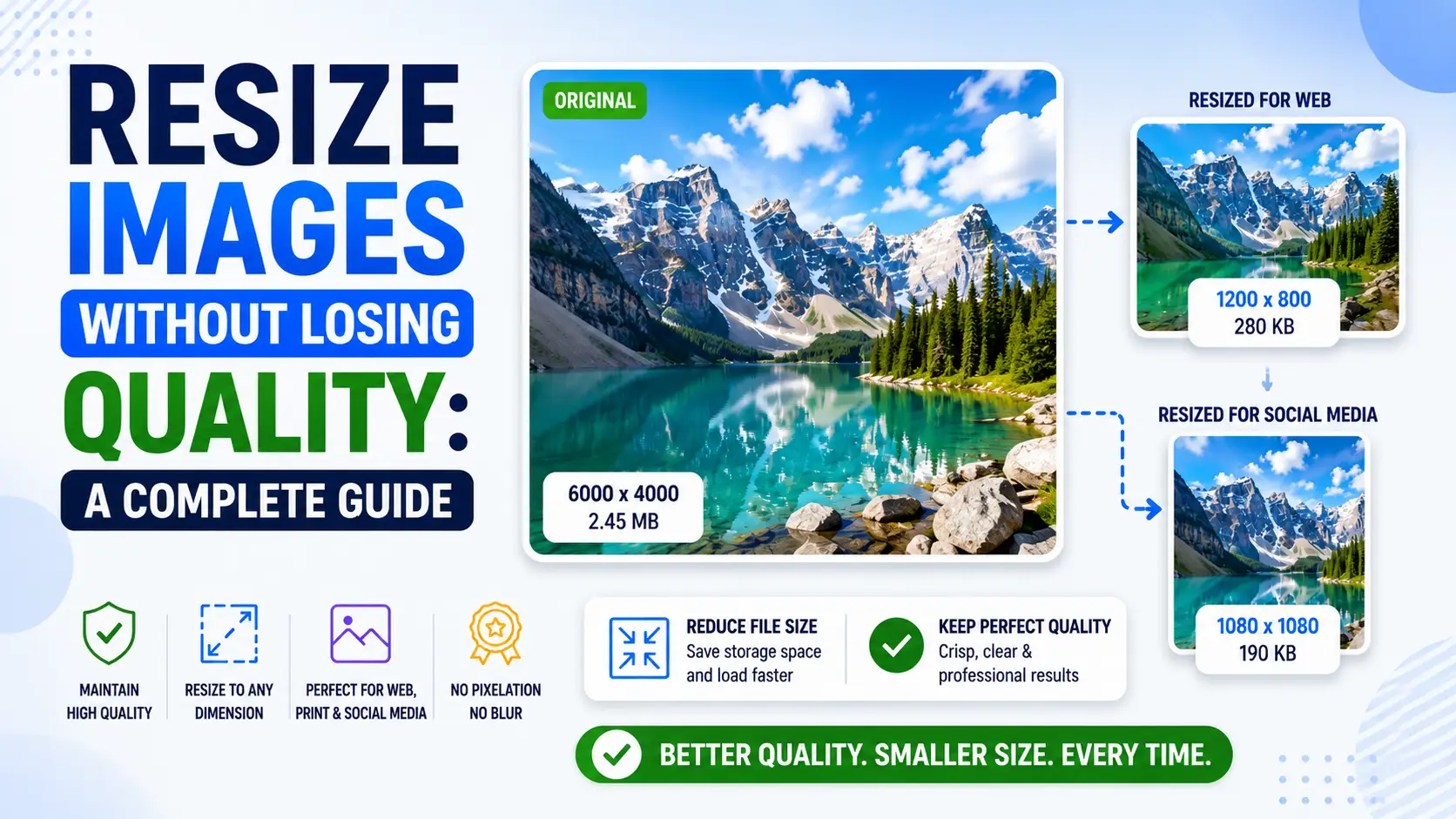
If your input is 4:3 and your target is 16:9, you have three options: crop to fit, letterbox or pillarbox with neutral pixels, or stretch. The third option is never correct. Stretching distorts the image in a way the human eye is highly attuned to, particularly for faces. A stretched face looks subtly wrong in a way that is hard to articulate but immediately noticeable. Cars look melted. Buildings look tilted. Text looks italicized. Cropping to fit means selecting a region of the input that matches the target aspect ratio and discarding the rest. The advantage is that you use the full target resolution. The disadvantage is that you may lose important content at the edges of the frame — particularly if the subject is off-center or if the original composition relied on negative space. Padding to fit means resizing the image so that its longest dimension matches the target, then filling the remaining space with a neutral color (usually black or white, sometimes a blurred version of the image). The advantage is that you preserve the entire original composition. The disadvantage is that you waste resolution on the padding, which can be a problem if the target size is small. For most use cases, cropping is the right choice. The key is to crop intelligently — keep the subject centered, preserve important detail at the edges, and use face detection if available to ensure faces are not cropped out. EditPhotosForFree's resizer offers all three modes (crop, pad, stretch) with a live preview, and uses face detection by default when cropping portraits. A specific case where padding is preferred is when you need to fit multiple images into a uniform aspect ratio for a gallery or grid. Padding all images to the same aspect ratio (with black bars as needed) ensures the grid looks consistent, while cropping each image to fit would produce a visually jarring mix of compositions. For social media, each platform has specific aspect ratio requirements that you should follow precisely. Instagram feed posts should be 1080x1080 (square) or 1080x1350 (portrait, 4:5) — the latter takes up more screen space on mobile and is generally preferred. Instagram stories and TikTok should be 1080x1920 (9:16 portrait). Twitter/X images should be 1200x675 (16:9). Open Graph images (the preview shown when you share a link) should be 1200x630. Email hero images should be 600x300 at 1x (so 1200x600 actual). Website hero images depend on layout, but 1920x1080 is a safe maximum — larger than that and you are wasting bandwidth on pixels most viewers will never see.
Color space and gamma: a subtler source of error
Most photographers know that you should resize in the right color space, but the details are often glossed over. The issue is that sRGB (the default color space for most images) uses a gamma curve to encode brightness. Linear light is multiplied by a gamma of approximately 1/2.2 before being stored as an 8-bit value, which gives more precision to shadows (where the eye is more sensitive) and less to highlights (where it is less sensitive). When you resize an image, the interpolation averages pixel values. If you average in gamma-encoded space, you are effectively computing a weighted average of brightness values that have already been non-linearly transformed. The result is incorrect — mid-tones become too dark, highlights become too bright, and the overall image acquires a slightly off contrast. For a 2x downscale of a typical photograph, the error is small enough that most viewers will not notice. For larger downscale factors or for images with strong color contrast, the error becomes visible. The fix is to convert the image to linear light before resizing and convert back afterward. Most modern image editors and libraries handle this correctly. Photoshop, GIMP, EditPhotosForFree, and the major browser Canvas APIs all resize in linear light by default. The catch is that some older libraries and some DIY implementations do not — if you are writing your own resize code, you need to handle the gamma conversion explicitly. A related issue is color space conversion. If your image is in Adobe RGB or ProPhoto RGB (wider gamut color spaces used by professional photographers), resizing in those color spaces is fine but you need to convert to sRGB before exporting for the web. Failing to do so produces images that look correct in color-managed applications (Photoshop, Safari) but washed out in non-color-managed applications (most browsers, most mobile apps). The cleanest workflow is: edit in a wide-gamut color space (ProPhoto RGB or Adobe RGB), resize in linear light, convert to sRGB as the final step, and export. This preserves the maximum amount of color information throughout the workflow and produces consistent output across all viewing environments.
Common target sizes for 2026
The right output size depends entirely on where the image will be displayed. Here are the sizes I use for common targets in 2026, with notes on why each is what it is. Instagram feed posts: 1080x1080 (square) or 1080x1350 (portrait). Instagram compresses anything larger than 1080px wide, so larger source images are wasted. The 4:5 portrait aspect ratio takes up more vertical screen space on mobile, which is why most Instagram influencers use it. Instagram stories and TikTok: 1080x1920 (9:16 portrait). This is the vertical video format that has taken over mobile content. Images in this aspect ratio should be designed for vertical viewing, not just cropped from horizontal originals. Twitter/X: 1200x675 (16:9). Twitter compresses images aggressively, and the 16:9 aspect ratio ensures the image shows up as a large preview in the timeline rather than a small thumbnail. Open Graph images: 1200x630. This is the preview image shown when you share a link on Facebook, LinkedIn, Slack, or any other platform that respects Open Graph metadata. The 1.91:1 aspect ratio is the standard. Email hero images: 600x300 at 1x display, so 1200x600 actual pixels for retina displays. Most email clients ignore images wider than 600px, so this is the maximum useful width. Be aware that some email clients (notably Outlook desktop) do not support modern image formats — stick with JPG. Website hero images: depends on layout, but 1920x1080 is a safe maximum. Larger images are wasted on most displays and dramatically increase page load time. For full-bleed hero images that span the viewport, consider serving different sizes for different screen widths using the srcset attribute. Thumbnail images: 400x300 or 600x450 for general use. Smaller than that and you lose detail; larger and you waste bandwidth. Print images: this depends on the print size and DPI. For an 8x10 print at 300 DPI, you need 2400x3000 pixels. For a 16x20 print at 300 DPI, you need 4800x6000 pixels. Always check the printer's requirements. For web use, the general rule is to serve the actual display size, not larger. Serving a 4K image to a 1080p display wastes bandwidth and CPU — the browser has to download the larger image and then downscale it on the fly, which uses battery on mobile devices. Use the srcset attribute on <img> tags to serve different sizes to different devices.
Responsive images, srcset, and the death of manual resizing
The traditional resize workflow — open image, set target dimensions, export — is wrong for the web. The web does not have one target size; it has dozens, varying by viewport width, device pixel ratio, and bandwidth. Serving a single resized image to every device wastes bytes on small screens and quality on large ones. The modern solution is responsive images via the srcset and sizes attributes, and understanding them changes how you should think about resizing for web delivery. The srcset attribute lets you specify multiple versions of an image at different widths. The browser picks the appropriate version based on the rendered size of the img element and the device pixel ratio. For example, srcset="image-480.jpg 480w, image-800.jpg 800w, image-1200.jpg 1200w, image-2000.jpg 2000w" tells the browser four versions are available. The sizes attribute tells the browser how wide the image will be displayed at various breakpoints, which lets the browser pick the right version before downloading any of them. A typical setup for a hero image: generate four variants at 480, 800, 1200, and 2000 pixels wide. Set sizes to something like "(max-width: 600px) 100vw, (max-width: 1200px) 50vw, 33vw". The browser does the math: on a 400px mobile viewport at 3x device pixel ratio, it needs 1200 pixels of resolution, so it picks image-1200.jpg. On a 1920px desktop at 1x, it needs about 633 pixels (33vw of 1920), so it picks image-800.jpg. The result is that every device gets an appropriately-sized image with no wasted bandwidth. The width variant generation is what build-time image tools (Next.js Image, Astro assets, Eleventy image) do automatically. You commit one source image; the build generates the variants; the HTML includes the srcset and sizes. Manual resizing is obsolete for web work — the build pipeline handles it. Art direction is a separate concern that srcset does not solve. If your hero image is a landscape shot that does not work on a portrait mobile screen, you need a different image, not a different size. The <picture> element with media-queried <source> tags solves this: serve a cropped portrait version to mobile and the full landscape version to desktop. This is art direction — choosing different images for different contexts rather than just different sizes of the same image. Device pixel ratio (DPR) is the multiplier that makes responsive images complicated. A 400px-wide phone at 3x DPR renders at 1200 device pixels, so it needs an image at least 1200px wide to look sharp. Most modern phones are 2x or 3x; most laptops are 1x or 2x; 4K monitors are typically 1.5x or 2x. The srcset attribute handles this automatically when you specify widths, but you need to generate variants wide enough to cover the highest DPR you support — typically 3x for mobile. The bandwidth dimension is harder. Browsers can detect effective connection type (4g, 3g, 2g, slow-2g) via navigator.connection.effectiveType, but srcset does not directly use this. The result is that on a slow connection, the browser still downloads the variant sized for the viewport, which may be larger than necessary. Some sites implement custom logic to serve smaller variants on slow connections, but this is not standardized. The pragmatic approach is to generate enough variants that even the largest is acceptable on a slow connection — typically capping at 2000px wide for hero images and 1200px for content images. For non-web use cases (print, email, social media), manual resizing is still required. Print requires specific DPI (typically 300 DPI for offset, 150-200 DPI for inkjet), which means a 4x6 inch print needs 1200x1800 pixels. Email requires smaller images (600x300 for hero images) because many email clients have file size limits. Social media has platform-specific aspect ratios that require cropping rather than just resizing. The web workflow is automated; the non-web workflows are still manual.
Responsive images and srcset: the right size for every device
The single most impactful resize optimization for web performance is serving different image sizes to different devices. A 4K desktop monitor needs a 1920px wide hero image. A phone needs a 400px wide version. Serving the 4K image to the phone wastes 90% of the bandwidth and slows the page load by several seconds. The srcset attribute on the img element solves this by letting the browser choose the appropriate size based on the device's screen width and pixel density. The srcset syntax is straightforward. Specify multiple image versions at different widths, and let the browser pick: <img srcset="hero-400.webp 400w, hero-800.webp 800w, hero-1200.webp 1200w, hero-1920.webp 1920w" sizes="(max-width: 600px) 100vw, (max-width: 1200px) 50vw, 33vw" src="hero-800.webp" alt="...">. The sizes attribute tells the browser how wide the image will be displayed at different viewport widths; the browser picks the smallest srcset entry that is large enough for the display size. The key mistake most developers make is providing too few size variants. Two variants (400w and 1200w) leave a gap: tablets at 800px display width get the 1200w version (50% too large) or the 400w version (50% too small). Four variants (400w, 800w, 1200w, 1920w) cover the breakpoints that matter: phones (400-600px display), tablets (800-1000px display), laptops (1200-1400px display), and desktops (1600-1920px display). Each variant should be resized using Lanczos interpolation for downscaling, at the exact pixel width indicated by the descriptor. The aspect ratio should be consistent across all variants. If the hero is 16:9 at 1920px, it should be 16:9 at 400px, 800px, and 1200px. Do not crop differently for different sizes — this creates a jarring experience when the browser switches variants during resize. If the composition needs to change for mobile (showing the center crop rather than the full width), use the crop parameter in the image CDN or build tool rather than pre-cropping the source images. For the picture element (format selection with srcset), combine both: <picture> <source srcset="hero-800.avif 800w, hero-1200.avif 1200w" type="image/avif"> <source srcset="hero-800.webp 800w, hero-1200.webp 1200w" type="image/webp"> <img src="hero-800.jpg" alt="..."> </picture>. The browser picks the first format it supports, then picks the right size within that format. This gives you both format optimization and size optimization in a single element.
Resize for print: DPI, physical dimensions, and the 300 PPI myth
Print resizing follows different rules than web resizing, and the most persistent myth in print preparation is that you always need 300 DPI. The reality is more nuanced. The right resolution depends on the viewing distance, the print method, and the output medium. The 300 DPI guideline originates from offset printing, where the halftone screen frequency is typically 150 lines per inch (LPI). The Nyquist theorem requires at least 2 samples per signal cycle, so 150 LPI requires 300 DPI. This is correct for offset printing viewed at normal reading distance (12-18 inches). But not all print is offset, and not all print is viewed at reading distance. Inkjet printing typically uses stochastic (FM) screening rather than halftone (AM) screening, which means the DPI-to-detail relationship is different. Most consumer inkjet printers produce excellent output at 240-300 DPI at the actual print size. Professional inkjet printers (Epson SureColor, Canon imagePROGRAF) produce excellent output at 150-200 DPI because their finer ink droplets resolve more detail per inch. For inkjet printing, the practical guideline is: resize to the physical dimensions at 240-300 DPI for consumer printers, 150-200 DPI for professional printers. Large-format printing (banners, posters, signage) is viewed from greater distances, which reduces the required DPI. A poster viewed from 6 feet away looks sharp at 100-150 DPI at print size. A billboard viewed from 50 feet away looks sharp at 15-20 DPI at print size. The math is simple: the angular resolution of the human eye is about 1 arcminute, so at a viewing distance of D inches, the minimum resolvable detail is approximately D/340 inches. At 6 feet (72 inches), that is about 0.21 inches, or roughly 120 DPI. The practical workflow for print resizing is: determine the physical print dimensions (in inches or centimeters), determine the print method (inkjet, offset, large-format), determine the viewing distance, and calculate the required DPI. For most print work, 300 DPI at print size is a safe default. For large-format work, calculate based on viewing distance rather than using a fixed number. And always resize in the correct color space (sRGB for consumer printing, Adobe RGB or CMYK for professional printing) to avoid color shifts in the output.
Platform-specific resize targets: the complete 2026 reference
Every platform has specific image dimension requirements, and uploading the wrong size triggers silent re-compression that degrades quality. Here is the complete reference for 2026, based on current platform documentation and our own testing. Instagram: feed posts 1080x1080 (square) or 1080x1350 (4:5 portrait), stories and reels 1080x1920 (9:16), carousel 1080x1080 or 1080x1350. Instagram compresses anything wider than 1080px, so larger source images are wasted. The 4:5 portrait ratio takes up more vertical screen space on mobile, which is why most Instagram influencers use it. TikTok: 1080x1920 (9:16) for all content. TikTok does not support horizontal or square video well — the entire interface is designed for vertical content. Upload at exactly 1080x1920; the app will crop or pad any other aspect ratio. YouTube: thumbnail 1280x720 (16:9), video 3840x2160 (4K) or 1920x1080 (1080p). YouTube re-encodes all uploads, so the format choice for upload is less critical than for other platforms — YouTube accepts almost anything and transcodes to its own formats. But uploading at the highest quality you have ensures the re-encoding has the most to work with. Twitter/X: 16:9 at 1200x675 for timeline previews, up to 4096x4096 for full-size images. Twitter compresses aggressively, so quality 85-90 JPG or WebP is the right starting point. The 16:9 ratio ensures the image shows as a large preview rather than a small thumbnail. Facebook: 1200x630 for link previews (Open Graph), 1080x1080 for feed posts, 1200x628 for shared links. Facebook re-encodes to WebP internally regardless of upload format. LinkedIn: 1200x627 for shared links, 1080x1080 for feed posts, 1584x396 for profile banners. LinkedIn compresses less aggressively than Twitter, so quality 85 JPG is usually sufficient. Email: 600px wide maximum for most email clients. Height is flexible but keep total email images under 200 KB for Gmail compatibility. JPG at quality 75-85, 600px wide, is the safe default. Open Graph (any platform): 1200x630 at quality 80. This is the preview image shown when any platform renders a link card. The 1.91:1 aspect ratio is the standard across Facebook, LinkedIn, Slack, Discord, and iMessage. Favicon and app icons: 512x512 PNG for the master, with 192x192, 180x180, 152x152, 144x144, 128x128, 96x96, 72x72, and 48x48 variants generated from the master. Use PNG for icons with transparency, SVG for scalable icons, and avoid JPG for icons entirely (JPG does not support transparency and introduces artifacts on sharp edges).
Conclusion
Resizing is not complicated, but it does require choosing the right interpolation algorithm for your case. Use Lanczos for downscaling, AI for upscaling natural photographs, and bicubic for general use. Never stretch — always crop or pad. Resize in linear light to avoid gamma-induced mid-tone errors. And always export at the exact size your use case requires, using srcset to serve different sizes to different devices. The right resize workflow produces output that is visually indistinguishable from the original at the target size, with no wasted bandwidth on pixels the viewer will never see.