Every photo editor has had the experience: pick two colors with the same HSL lightness, and one of them looks noticeably brighter than the other. Pick three colors with the same HSL saturation, and your eye tells you they are nothing alike. This is not a bug in your editor — it is a fundamental property of the color space you are working in. HSL, the color picker default in every major photo editor for the last 25 years, is not perceptually uniform. Equal increments in HSL channels do not correspond to equal perceptual changes. This guide explains why, walks through the perceptual color spaces (Lab, LCH, OKLCH) that are finally arriving in browsers and editors, and shows how this changes your editing workflow in practice — not in the abstract, but in the kind of details that determine whether a grade looks expensive or cheap, a palette looks deliberate or accidental, and a layout feels balanced or slightly off.
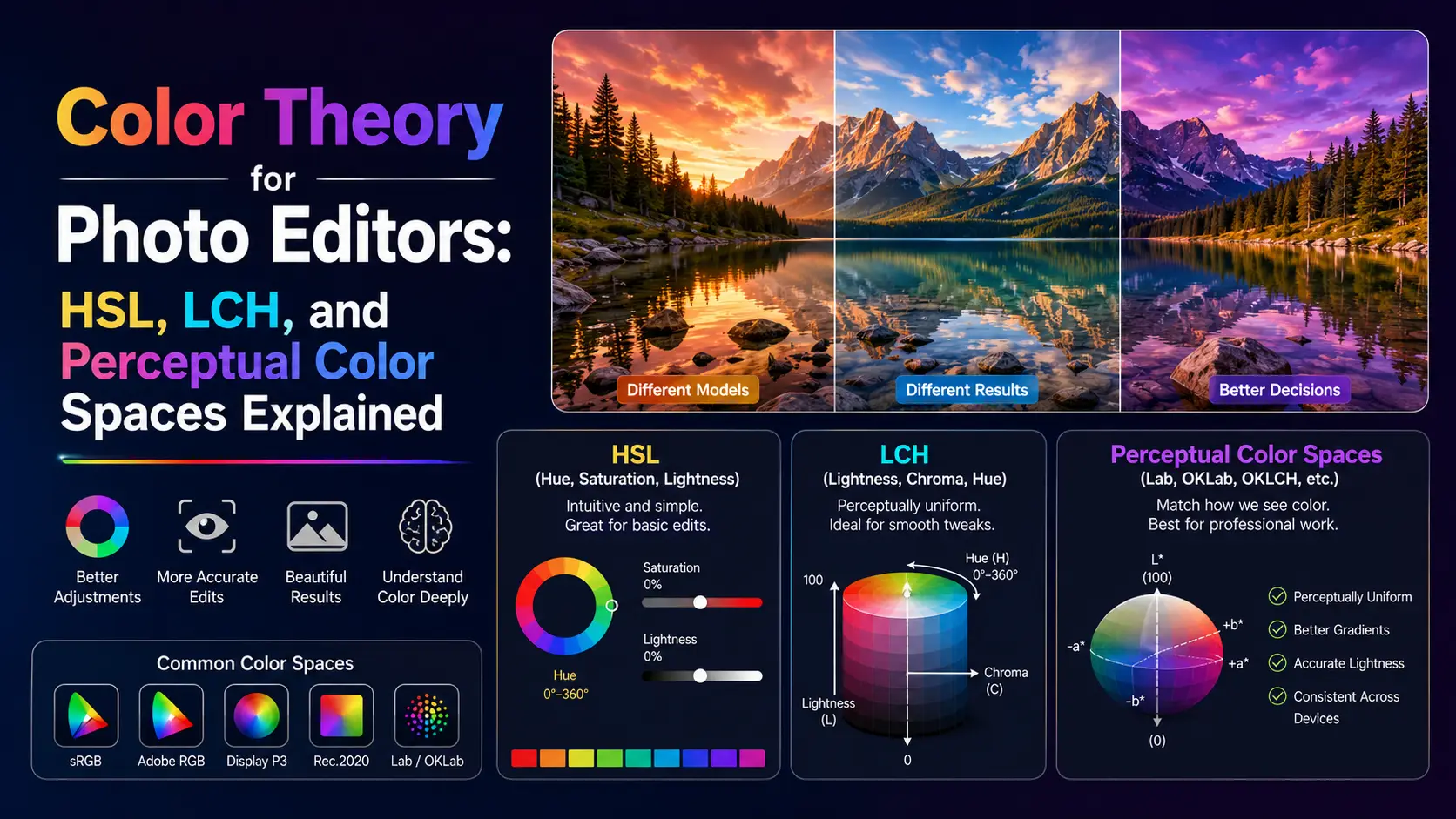
The lie at the heart of HSL
HSL was designed in 1978 by Alvy Ray Smith at NYIT for computer graphics. The goal was a color model that mapped intuitively to how artists think about color — hue (which color), saturation (how intense), and lightness (how bright). The math is straightforward: HSL is a cylindrical transformation of RGB, computed directly from the RGB primaries of whatever color space you happen to be in. This is exactly why it fails perceptually. The problem is that sRGB primaries — and the human visual system they are trying to stimulate — are not perceptually uniform. A yellow at HSL lightness 50% reflects roughly twice the perceptual brightness of a blue at HSL lightness 50%. The reason is rooted in the physiology of the human eye: our L (long-wavelength) and M (medium-wavelength) cones overlap heavily in the green-yellow region, giving us far more sensitivity to yellow-green light than to blue light. HSL does not account for this. It just maps RGB values through a cylinder. A practical consequence: if you generate a 10-step lightness ramp in HSL from pure black to pure white, yellow will appear to jump to near-white by step 4, while blue will still look quite dark at step 6. Try this in any editor. The same issue affects saturation — HSL saturation of 100% means very different things for different hues, because the maximum achievable chroma in sRGB varies dramatically by hue. Pure yellow at 100% saturation in sRGB is far less chromatic than pure blue at 100% saturation, because sRGB blue primary is much more saturated than its green primary. This problem was identified in the 1930s by Albert Munsell, who developed the Munsell color system based on perceptual experiments with human observers. Munsell's system used perceptually uniform steps in hue, value (lightness), and chroma. The system is still used in soil science, beer brewing, and other fields where precise color communication matters. HSL ignored all of this work in favor of mathematical convenience, and the result is that every HSL-based palette generator produces palettes that look slightly off in a way most designers cannot articulate but can feel. There is a second issue with HSL that almost nobody talks about: it is tied to whatever RGB space you compute it from. HSL of sRGB is different from HSL of Display P3 is different from HSL of ProPhoto. So when you read an HSL value off a color picker without knowing the underlying RGB space, you do not actually know what color it is. This bit me years ago when shipping a brand color across platforms: the same HSL value looked different on the web (sRGB), different on iOS (Display P3), and different on a print proof (Adobe RGB). The fix was to specify colors in a space-explicit way — which is exactly what color() and oklch() in CSS now let you do.
sRGB, Adobe RGB, ProPhoto, Display P3: what they actually mean
Before diving into perceptual color spaces, you need to understand the gamut problem. A color space is defined by three things: its primaries (the red, green, blue reference points), its white point (typically D65, daylight at 6500K), and its transfer function (gamma). The gamut is the range of colors that can be expressed as combinations of the primaries. sRGB, designed by Microsoft and HP in 1996, is the default color space of the web. Its primaries were chosen to match the CRT monitors of the era, which means it is a relatively small gamut — about 35% of the CIE 1931 visible color space. sRGB cannot represent highly saturated cyans, magentas, or greens. If you photograph a peacock feather or a tropical flower in sRGB, the colors get clipped to the gamut boundary, losing the very saturation that made them striking. For most consumer photography (portraits, landscapes, street), sRGB is fine. For product photography with saturated fabrics, jewelry, or anything neon, sRGB is a noticeable downgrade. Display P3, originally a DCI-P3 cinema standard adopted by Apple in 2015, covers about 45% of visible colors. Every iPhone since the iPhone 7, every iPad Pro, and every Mac since 2015 has a Display P3 display. If you are editing photos in sRGB and viewing them on a P3 display, you are leaving 10% of the display gamut unused. Modern photo editors (Lightroom, Capture One, Affinity Photo) default to editing in P3 or wider. The web is gradually catching up — CSS color(display-p3 ...) lets you target P3 displays directly. Adobe RGB (1998), designed by Adobe Systems for print workflows, covers about 50% of visible colors. Its green primary is more saturated than sRGB's, which gives it more headroom for cyans and greens — important for printing on CMYK presses, which can reproduce more saturated cyans and greens than sRGB can represent. Adobe RGB is the standard for print photography but is rarely the right choice for web work, because most monitors cannot display its full gamut, leading to flat-looking images on sRGB displays. If you have ever seen a photo on a website that looked washed out and green-tinted, that was probably an Adobe RGB image served without an ICC profile. ProPhoto RGB, designed by Kodak in 2003, covers about 90% of visible colors — and importantly, includes colors outside the visible spectrum (imaginary colors). ProPhoto is the working space of choice for high-end photography because it captures the full gamut of any camera sensor. The trade-off is that editing ProPhoto on a non-ProPhoto display means you cannot see what you are doing at the gamut edges. ProPhoto also requires 16-bit editing; in 8-bit, the wide gamut causes visible banding because the 256 steps per channel are spread across a much larger gamut. The right workflow in 2026 is: shoot RAW (which captures the camera's full gamut), edit in ProPhoto or a wide-gamut linear space, soft-proof in your target output space (sRGB for web, Adobe RGB for print), and export with embedded ICC profiles. Most editors do this transparently now, but if your editor is set to sRGB working space, you are silently throwing away 10-15% of the color your camera captured.
LCH and OKLCH: the perceptual color spaces finally arriving
CIELAB, designed by the International Commission on Illumination in 1976, was the first widely-adopted perceptual color space. It defines L (lightness) on a 0-100 scale where each unit is intended to be perceptually equal, and a/b axes for green-red and blue-yellow opposition. CIELAB is the foundation of every perceptual color system since. It is what Lightroom uses internally for its HSL adjustments, what Photoshop uses for Lab mode, and what ICC profile conversions use as a pivot space. CIELCH is CIELAB in cylindrical coordinates: L (lightness), C (chroma), H (hue). Two colors with the same L value are perceptually equally bright — at least in theory. In practice, CIELAB has known issues: its blue-purple hue axis drifts perceptually (a 30-degree hue shift in the blue region looks larger than a 30-degree shift in the yellow region), and its chroma steps are not quite uniform across hues. These issues were acceptable when LAB was used for printer profiling but become very visible when you generate palettes programmatically. I spent a week in 2021 building a palette tool on top of CIELCH before realizing the blue-purple drift was making every palette look subtly wrong in that region. OKLab, designed by Björn Ottosson in 2020, fixes CIELAB's issues. OKLab uses a different color appearance model based on more recent perceptual data from the Cambridge Research Systems experiments. Its lightness matches perceived lightness better than CIELAB across the full hue range, its hue is more uniform (no blue-purple drift), and its chroma is more uniform across hues. OKLCH is OKLab in cylindrical coordinates. The CSS Color Module Level 4 specification includes both lab(), lch(), oklab(), and oklch() functions, and they are supported in all major browsers as of 2023 (Chrome 111+, Safari 16.4+, Firefox 113+). What this means for designers and photo editors: for the first time, you can specify colors in a perceptual space directly in CSS. Want a 5-step lightness ramp from black to white where each step looks equally spaced? oklch(20% 0 0), oklch(40% 0 0), oklch(60% 0 0), oklch(80% 0 0), oklch(100% 0 0). Want a palette where every color has the same perceptual chroma? Pick any five hues at oklch(70% 0.12 [hue]). The result looks balanced in a way HSL palettes never do. I rebuilt my palette generator on OKLCH in 2023 and the output quality jump was immediately obvious — the same hue combinations that looked slightly off in HSL looked clean and intentional in OKLCH. The OKLCH color picker at oklch.com is the reference tool for exploring this space. For programmatic work, the Culori JavaScript library and Color.js both support OKLab and OKLCH, and Color.js's author Chris Lilley is one of the editors of the CSS Color specification, so the implementation matches the spec exactly.
How this changes your editing workflow
Once you internalize that HSL lies, several editing workflows improve. First, palette generation. Most palette generators (Coolors, Adobe Color) use HSL. If you switch to an OKLCH-based generator (oklch.com, or the Culori playground), palettes look more cohesive because the perceptual chroma is consistent. A common pattern: pick 5 hues evenly spaced around the OKLCH color wheel, all at the same L and C. The result is a palette that feels balanced in a way HSL palettes cannot. Specifically, equal-chroma palettes in OKLCH tend to read as designed, while equal-saturation palettes in HSL tend to read as random. Second, color grading. When you adjust the hue of a sky in Lightroom, the underlying math is in a perceptual space (ProPhoto linear, with Lab-like adjustments). A 10-degree hue shift in Lightroom's hue slider does not correspond to 10 degrees in HSL — it corresponds to roughly 10 degrees in a Lab-like space, which is what you actually want. This is why Lightroom's hue slider feels more intuitive than Photoshop's HSL adjustment layer, even though they appear to do the same thing. Third, gradient generation. CSS gradients specified in HSL pass through muddy middle ground. Try linear-gradient(to right, hsl(60 100% 50%), hsl(240 100% 50%)) in a browser — it goes through muddy gray at the middle because HSL hue interpolation passes through green-cyan-blue, which has very different perceptual lightness than the endpoints. The same gradient in OKLCH stays vibrant: linear-gradient(in oklch to right, yellow, blue). Modern CSS lets you specify interpolation color space, and in oklch is the right default for almost everything. Fourth, accessibility. WCAG contrast ratios are computed in sRGB, which has its own perceptual issues — it overestimates contrast for dark colors and underestimates for light colors. Work is ongoing to update WCAG 3.0 to use APCA (Accessible Perceptual Contrast Algorithm), which is perceptually more accurate. For now, when checking contrast, prefer APCA calculators (APCAcalc, or the contrast tools in modern browser dev tools) for text below 24px. For large text, the existing WCAG ratios are adequate. Fifth, browser dev tools. Chrome 111+ and Safari 16.4+ support OKLCH in the color picker. When you click on a color in dev tools, you can switch between sRGB hex, HSL, and OKLCH. The OKLCH view shows you perceptually uniform lightness, which makes it easier to spot contrast issues. If two elements have OKLCH L values within 10% of each other, they will likely look too similar at a glance — even if their HSL lightness values look very different. Sixth, themeable design systems. If your design system uses OKLCH for its color tokens, you can generate perceptually consistent light/dark modes by simply shifting L while holding C and H constant. This is what Tailwind 4.0 does internally for its color palette, and the result is noticeably more cohesive than Tailwind 3.x's HSL-derived palette.
HDR, wide-gamut displays, and the future of web color
The next frontier beyond OKLCH is high-dynamic-range (HDR) and wide-gamut display support. HDR displays can produce peak brightness of 1000 nits or more, compared to about 400 nits for a standard SDR display. The result is that highlights (the sun, neon signs, specular reflections) can be rendered at actual brightness rather than compressed into the sRGB range. This changes image editing more than you might expect. The technical foundation is the PQ (Perceptual Quantizer) transfer function defined in SMPTE ST 2084, which maps luminance values to code values in a way that matches human brightness perception across a 0-to-10,000-nit range. PQ is the transfer function used by HDR10 and Dolby Vision. An alternative is HLG (Hybrid Log-Gamma), used primarily in broadcast television. Both are supported in CSS Color Module Level 4 via the color() function: color(rec2100-hlg 1.0 0.5 0.3) or color(rec2100-pq 0.7 0.4 0.2). Browser support for HDR CSS is still emerging as of 2026. Chrome on HDR-capable displays (those running macOS or Windows with HDR mode enabled) correctly renders PQ and HLG colors. Safari has partial support. Firefox is in development. The practical advice for production: serve HDR assets only to clients you have detected as HDR-capable, via JavaScript queries to the MediaCapabilities API or CSS @media (dynamic-range: high). For SDR clients, fall back to SDR assets. Editing HDR images requires an HDR-capable monitor. The editing workflow is fundamentally different from SDR: you are deciding which parts of the image should be displayed at 400 nits (normal brightness) versus 1000+ nits (highlights). This is closer to grading for cinema than to traditional photo editing. DaVinci Resolve, Lightroom Classic (since 13.0), and Capture One (since 23) all support HDR editing workflows. The wider implication of HDR is that the sRGB assumption built into most web design is finally breaking down. For 25 years, web designers could assume every display was sRGB and design accordingly. Now we have displays spanning sRGB, Display P3, Adobe RGB, Rec.2020, and HDR — sometimes simultaneously across a user's devices. The right approach is to design in a wide-gamut working space (Display P3 minimum), export multiple variants, and serve the right one per client. This is more work than the sRGB-only era, but the visual quality gain on capable displays is significant — and the workflows and tooling have finally caught up to make it manageable for production work.
Practical: converting without data loss
Converting between color spaces is not free. When you convert from a wider gamut to a narrower one (ProPhoto to sRGB, for example), colors outside the target gamut get clipped to the gamut boundary. This is a lossy operation. The clipping algorithm matters: simple clipping produces banding and color shifts, while perceptual intent (used in print ICC profiles) tries to preserve the visual relationship between colors by compressing the entire gamut rather than clipping. For web work in 2026, the recommended setup is to edit in a wide-gamut working space (Display P3 or ProPhoto) in your photo editor, export with an embedded ICC profile (sRGB IEC61966-2.1 for legacy web, Display P3 for modern web), use the CSS color() function to specify colors explicitly — color(display-p3 0.8 0.2 0.3) instead of rgb(204 51 76). The browser interprets this as Display P3 if the display supports it, falling back to sRGB with clipping if not. Use @media (color-gamut: p3) to serve wider-gamut assets only to capable displays. For converting existing assets: the Culori library can convert any color between sRGB, Display P3, Adobe RGB, ProPhoto, Lab, LCH, OKLab, OKLCH, and a dozen other spaces. Use it in your build pipeline to generate variants. A typical setup is to author your design tokens in OKLCH, then generate sRGB hex fallbacks and P3 color() values for production CSS. Tools like Cubiculu, Style Dictionary, and Lightning CSS can do this automatically. Browser support for color() and OKLCH is now above 95% globally as of 2026, so you can use them in production without fallbacks for most audiences. For legacy browsers, the colors will be parsed as invalid and fall back to whatever earlier color declaration you provided — usually acceptable. The pattern is to declare sRGB first, then OKLCH: background: rgb(204 51 76); background: oklch(60% 0.18 25); The second declaration is ignored by browsers that do not support OKLCH, leaving the first in effect. This is the standard progressive-enhancement pattern. One thing to avoid: do not edit photos in HSL. If your editor offers OKLab or Lab mode (Lightroom's HSL panel does this internally, Affinity Photo has a Lab mode, Capture One's Color Editor works in a Lab-like space), use it. The results are more predictable and the adjustments feel more natural. The reason most HSL sliders in cheap editors feel wrong is that they are computed directly in sRGB HSL, not in a perceptual space — and the difference shows.
Conclusion
HSL has been the default color picker model for so long that most editors never question it. But HSL is a 1970s mathematical convenience, not a perceptual model. Once you switch to OKLCH for palette design, OKLab for color grading, and Display P3 for output, your work looks more cohesive, your gradients do not go muddy, and your edits behave the way your eye expects them to. The perceptual color spaces took 50 years to reach the browser, but they are here now — and there is no reason to keep using HSL for new work. The next time you reach for an HSL color picker, ask yourself whether you actually want mathematical convenience or perceptual accuracy. For almost every real-world task, the answer is the latter.